Name Sans is a modern interpretation of the mosaic name tablets of New York City subway stations.
It’s a big type family, featuring over a thousand glyphs across a wide range of weights and optical sizes, in both upright and italic styles. Despite this depth, its forms stem from a relatively small set of mosaic examples which are striking for their adherence to simple geometric forms. Put simply, Name Sans is a geometric-grotesque family (a ‘geo-grot’, as I have adopted as a shorthand) – a blend of the font genres geometric (e.g., Futura) and grotesque (e.g., Akzidenz) – but its unique origins and its complex technical side are a story unto themselves.
An underground encounter
As a newcomer to New York City in 2014, I depended on maps and station signage to guide me through my daily subway commute. Fresh out of design school and steeped in the history of the iconic wayfinding systems designed for the NYC Transit Authority in 1970 by Massimo Vignelli and Unimark, I was – frankly – starstruck. But as the weeks passed and I became less dependent on the most practical of signage, I started finding my attentions drawn more to the charming, distinctive details of each subway station. In particular, I became enamored with the tile mosaics that declared station names.
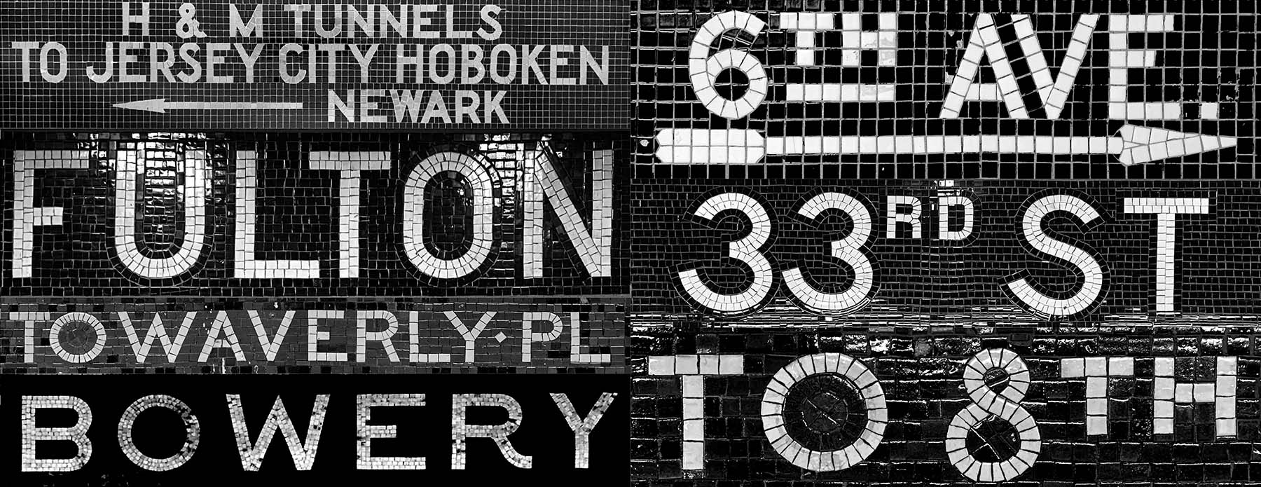
New York City’s subway was then 110 years old, its stations (and mosaics) built and restored by many different architects, craftspeople, and corporations, so it was no surprise to find great variety. Each mosaic was unique and beautiful in its own way, as only handcrafted things can be. For all the eccentricities, though, I sensed a stylistic system binding these seemingly disparate installations, and it became a favorite commuting pastime to observe, photograph, sketch, and consider these so-called ‘name tablets’.
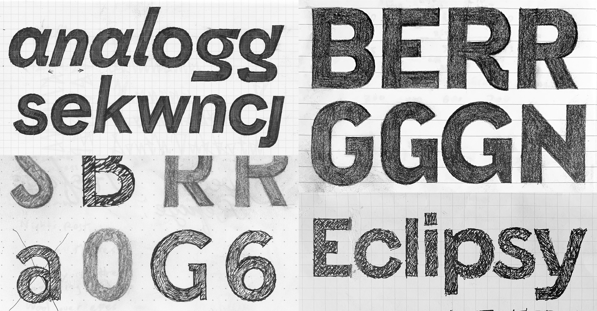
The oldest name tablets, those appearing in stations by architects Heinz & LaFarge starting from the system’s 1904 inception, use serifed type; those appearing in the stations by architect Squire J. Vickers after 1930, use sans-serif.1 I gravitated to the sans-serif designs because they felt both timeless and adaptable. (I’m doubly glad of this because, as I later learned, Greg Shutters was undertaking a modern interpretation of the serif mosaics, which became his excellent LaFarge type family.)
Dates derived from archival materials included in a 2019 NYC Transit Museum exhibit.
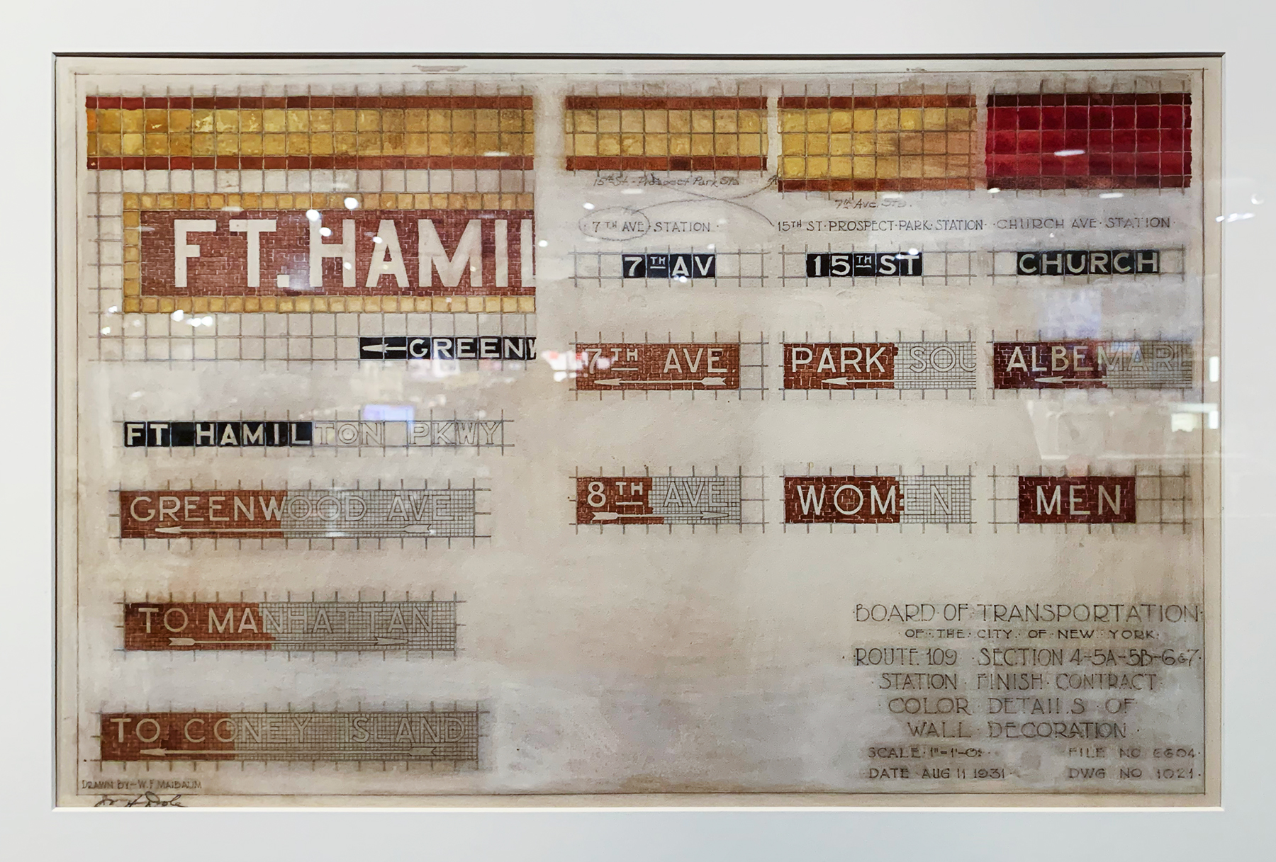
I started sketching the first forms that would become Name Sans in 2016, and I created a few quick digital drafts while studying at KABK TypeMedia in early 2018, but it wasn’t until I was wrapping up Recursive in late 2019 that I started designing Name Sans in earnest.
Assembling the pieces
As a contemporary digital type family, Name Sans was immediately at odds with its mosaic inspiration in two ways. First, the nature and origin of the subway mosaics inherently meant that there could be no single, authoritative blueprint to work from, and the elegant variances would need to be (in the vast majority of cases) distilled to standardized forms. Second, even after documenting the mosaics of dozens of stations, I found examples of only 40 or so characters – uppercase letters, numerals, arrows, and a few other symbols – a far cry from the hundreds of characters needed for a versatile font with even modest language support (Name Sans ultimately ended up supporting over 400 languages).

Making a complete typeface from the mosaics, therefore, was a task of identifying recurring themes, isolating my favorite quirks, and harmonizing them into a cohesive family. Even as I sought to create an honest reflection of a complex historical system, I recognized that Name Sans was inevitably going to be a very personal interpretation, possibly reflecting even my own commute by way of the name tablets I saw most frequently. Name Sans is not a replica. It is an extension, and it is an exploration of what a modern sans-serif can be.

From granular to continuous
The inescapable difference between mosaic and just about any other form of lettermaking – be it fountain-pen handwriting, movable-type letterpress, or even stone carving – is its discontinuity. There are no continuous lines, straight or otherwise, in a mosaic. Everything is a field of tiles, which our eyes and brains interpret as lines and circles, letters and symbols. When creating a mosaic, there is no need to compose perfect curves because there are no curves. The only requirement for perfection is a homogeneity of imperfection.
A digital typeface is the most extreme opposite: a collection of mathematically exact curves in which the smallest lump or accidental cusp can snag the eye and distract a reader. It takes years to become adept at drawing letters in general, but still more time to successfully transfer that skill into drawing with vectors (here’s an example video of such a drawing process). For a type designer, creating each new typeface can be a process of essentially re-training oneself to perceive how vectors can work best in that new style. Likewise, making Name Sans was a process of constant discovery and extensive iteration.
Geometry and low contrast
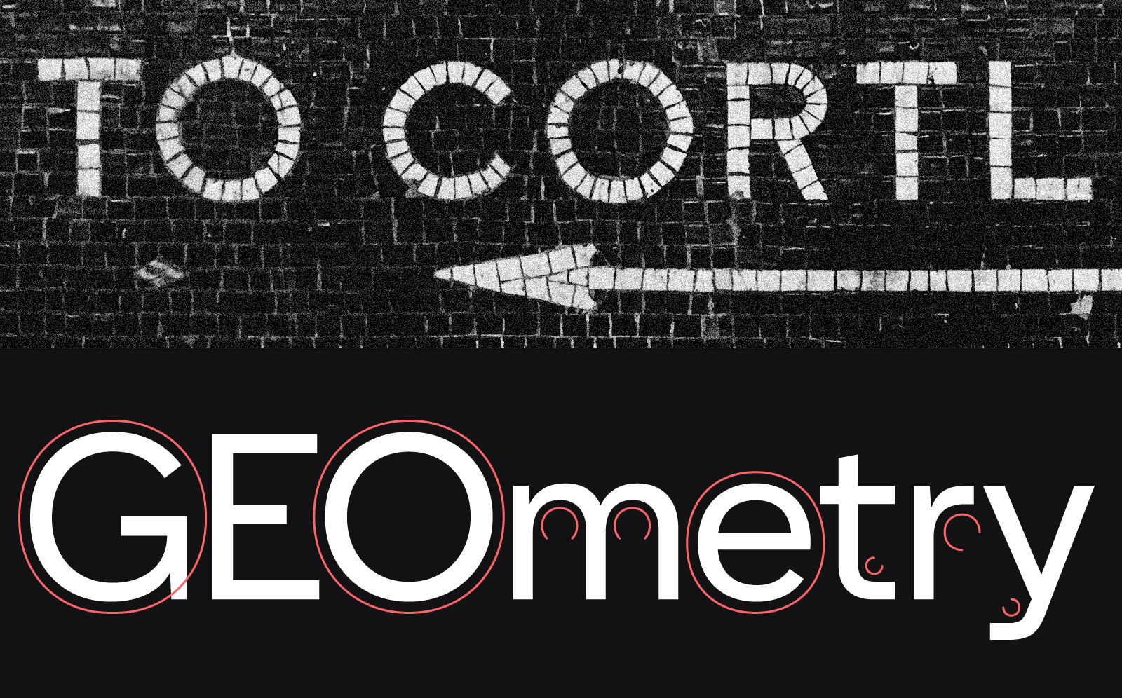
The mosaic letters that inspired Name Sans distinguish themselves by their adherence to geometry and their total lack of contrast. Circular forms tend to be very circular, and each stroke2 in a given glyph has the same width – 1, 2 or 3 tiles, depending on the size of the sign. Thus it was a given from the outset that Name Sans would be monolinear and geometric – at least in appearance. It’s easy to think that a geometric font would be the easiest style to make (isn’t it just drawing some lines and circles?), but the limitations of pure geometries quickly come into conflict with the needs of functional letterforms (an s built around two circles is a very narrow s). Moreover, our brains are not actually all that good at interpreting geometry correctly, especially within the context of reading. A true circle, in text, often appears to us as slightly diamond-shaped, the same line seen horizontally and vertically will look thicker in the horizontal orientation, and on and on. Achieving the illusion of pure geometry requires myriad optical corrections. Getting Name Sans to feel like the mosaic letters required just about every trick in the book, and the approach had to be further tuned for different optical sizes (but more on that later).
“Stroke” is a somewhat abstracted term in the context of letters so divorced from a pen or brush, but I will use it for the lack of a better word, following in the conceptual framework of Gerrit Noordzij.
Angled terminals
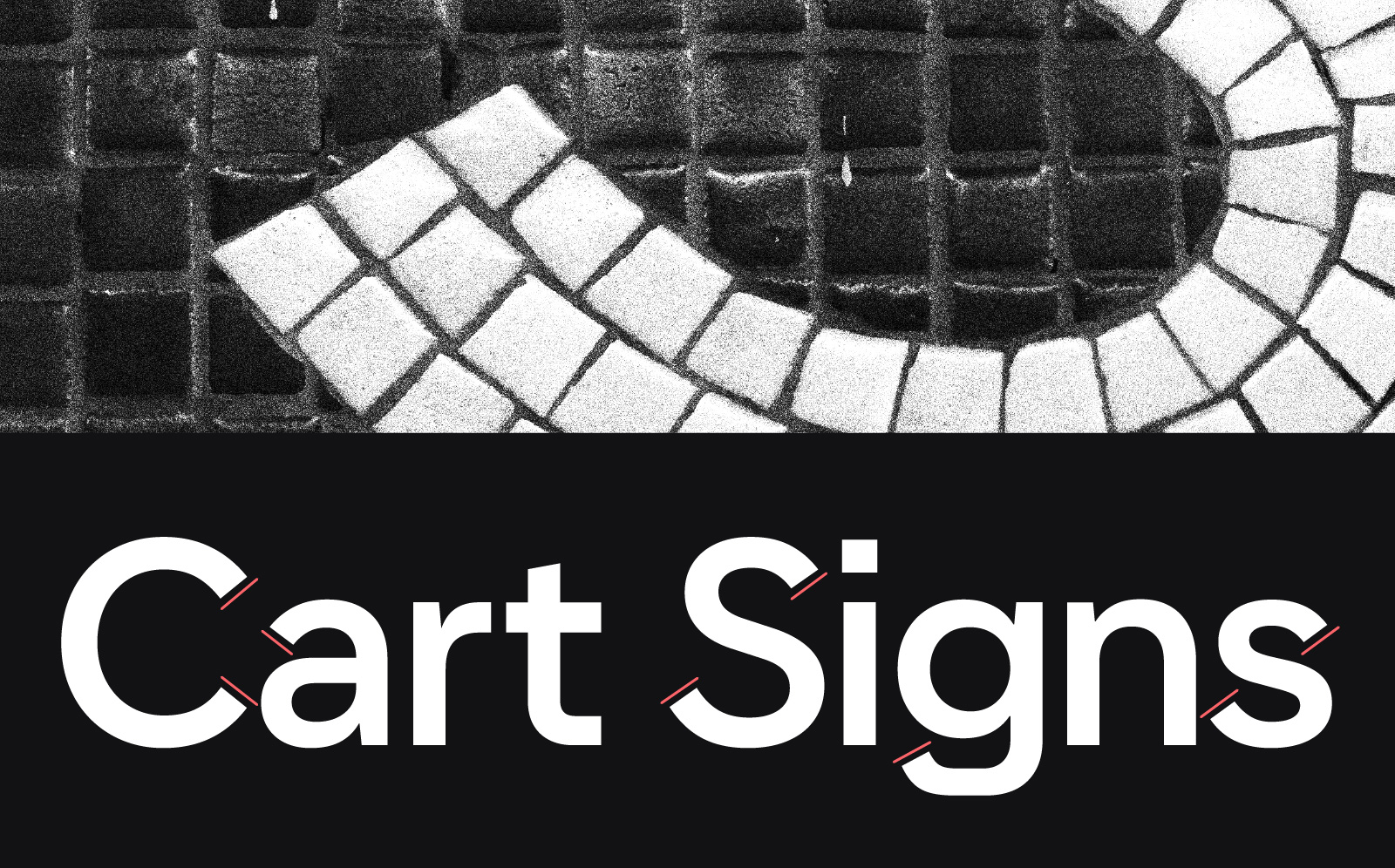
Some fonts, like Helvetica, have stroke endings (terminals) that are horizontal. Others, like Frutiger, have vertical stroke endings. The mosaics take a less rationalized approach, allowing strokes to end at angles, giving the appearance that they terminate at a right angle to the stroke direction, making for visually square corners. Name Sans follows suit.
Notches
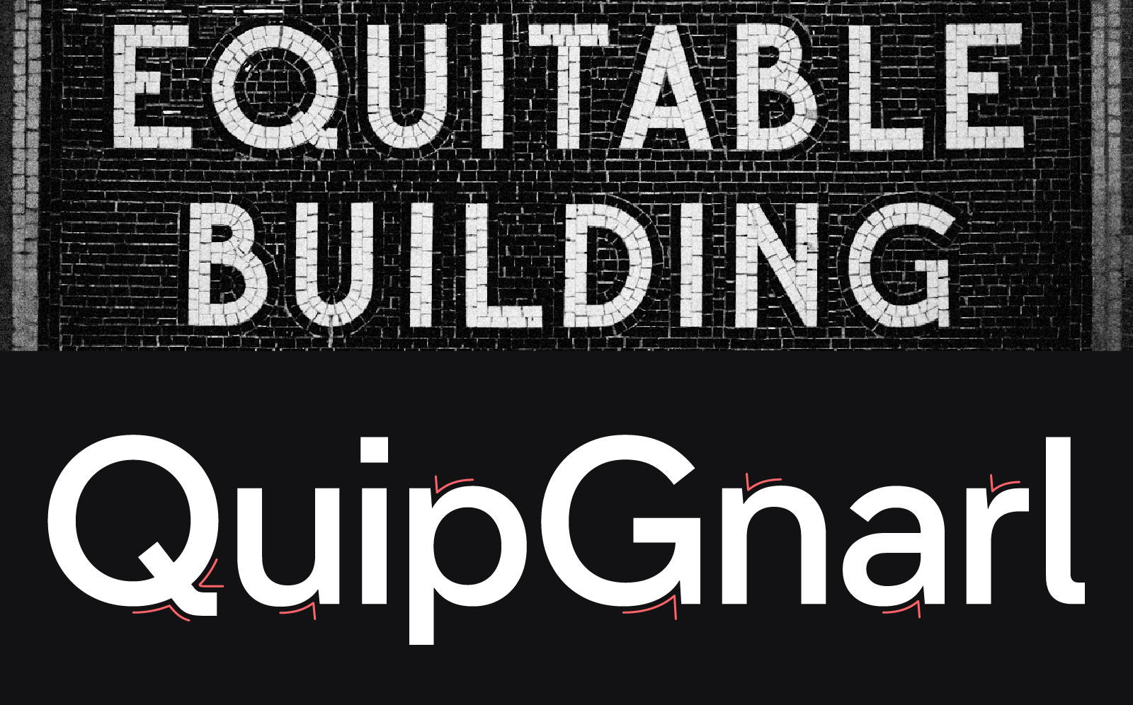
One of my long-time favorite mosaics in the system is a sign at the Wall St 4/5 station that directs riders to the Equitable Building. Its letters are among the most purely geometric and the resulting rhythm is pretty wild. While Name Sans demanded more regular proportions, this sign inspired several key design decisions. The spur of the G informed the “notches” in letters like a, n, p, r, u, and – obviously – G. Additionally, the rare instance of a mosaic Q (an absolute banger of a Q, luckily) was adopted as faithfully as possible.
Flattened segments
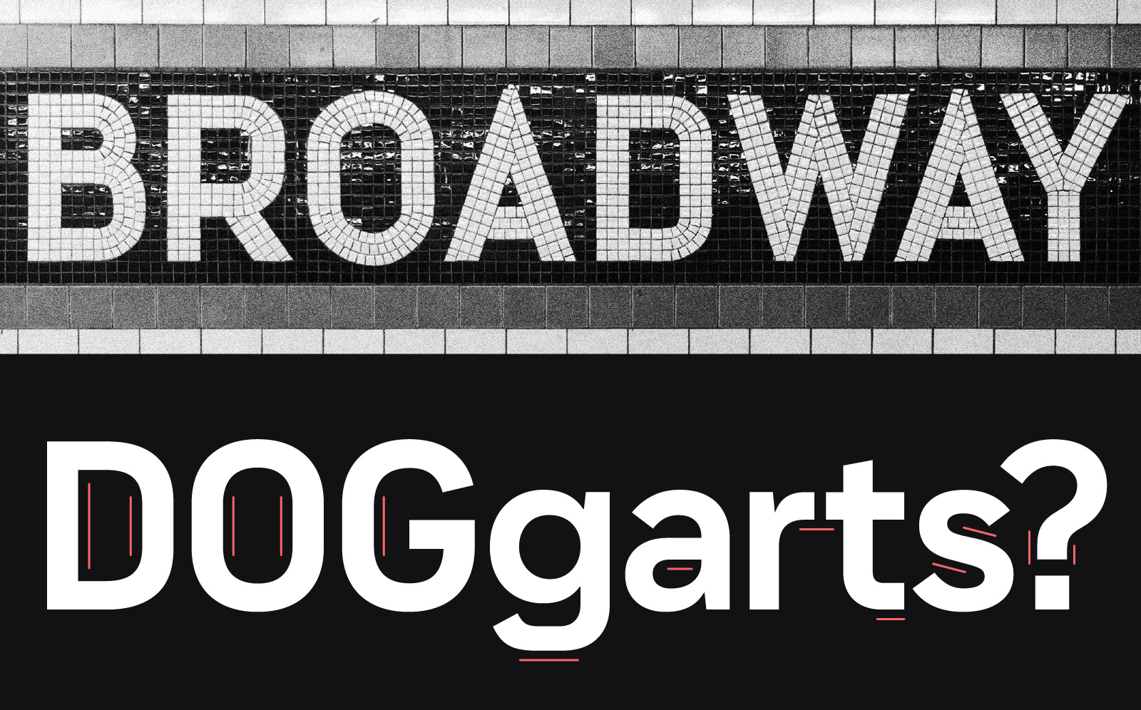
The mosaic letters are often surprisingly freeform and graceful, but the influence of their medium is ultimately inescapable. Notably, segments that would be shallow curves in most typefaces are flattened. (This seems to be especially common in signage along the F and A/C lines in Brooklyn but can be found system-wide.) Name Sans adopts flattened curves throughout lowercase. This detail appears most obviously in the descender of g, but also in the a, f, t, and others. (Inland Gothic № 8 from the American Type Founders, a contemporary of the original mosaics, was an additional reference in the absence of lowercase characters within the mosaics.)
Interior symmetry
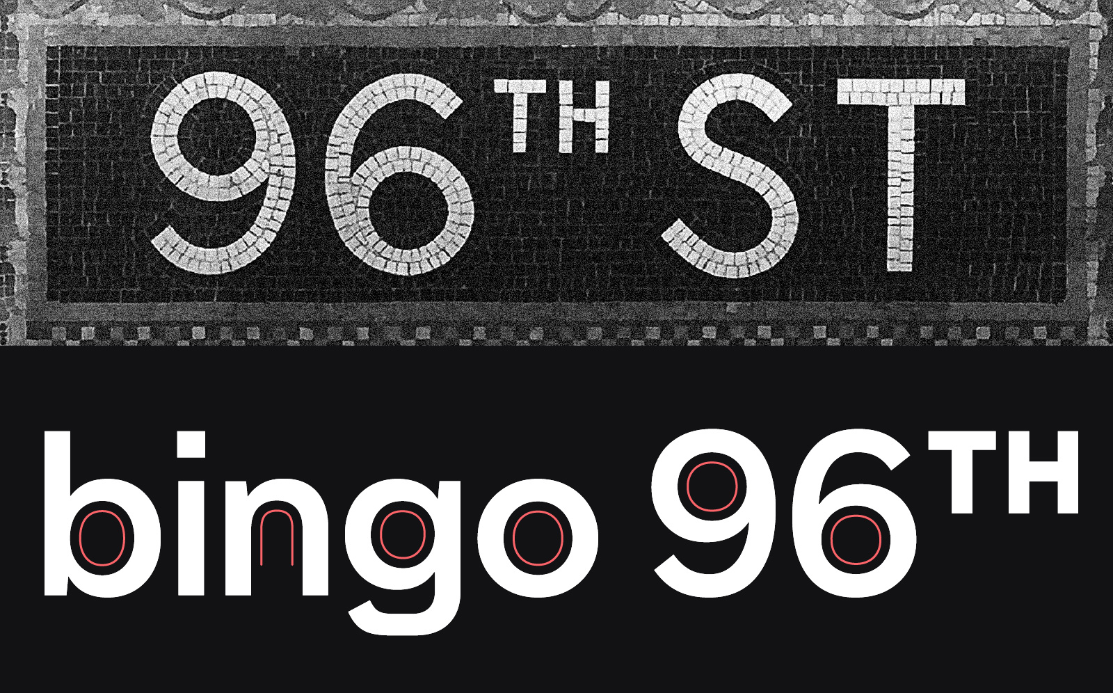
When 6 and 9 appear in the mosaics, their counters are delightfully circular, despite this giving the numerals an unexpected, almost spiral shape. In Name Sans, symmetric counters can be found in many characters where asymmetric counters would normally be found. These include n, b, g, and 6 and 9 – at least at display size (achieving acceptable readability at text sizes sometimes demanded traditional asymmetry).
Sharpened terminals
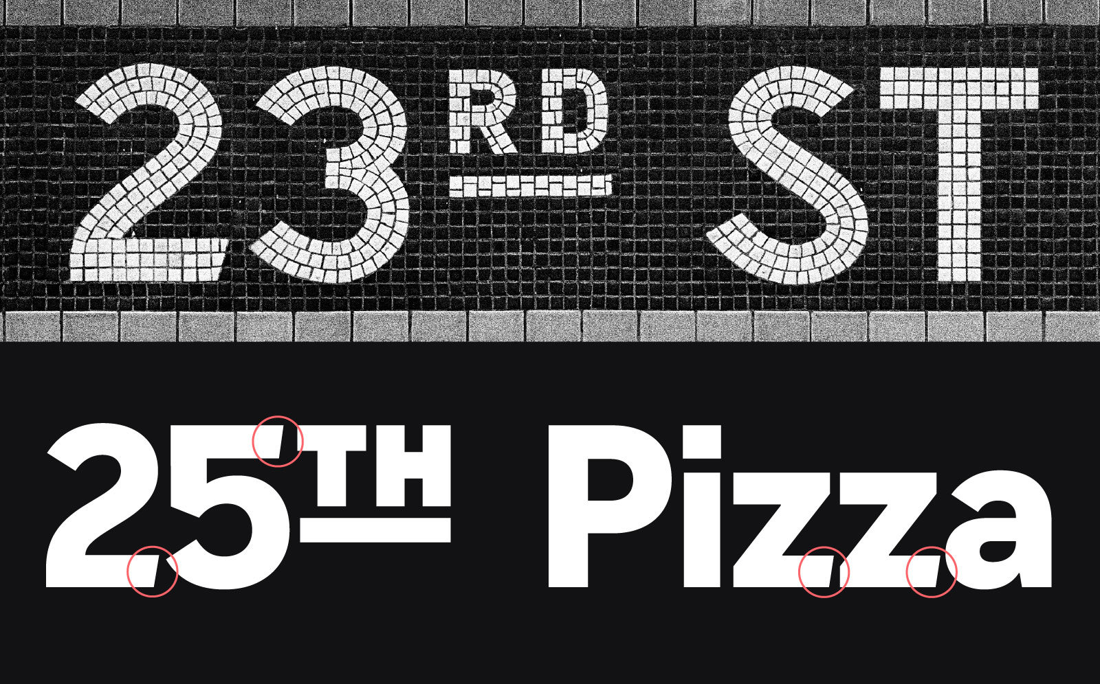
In the mosaics, some horizontal strokes terminate at a slight angle. While not consistent across stations, I found it a striking quirk worth preserving. In the tiles the only character exhibiting this feature reliably is the 2. In Name Sans, I let the feature creep into the top of 5 and the bottom of Z to bring a bit more tile-like sharpness into the family.
Sharp vertices
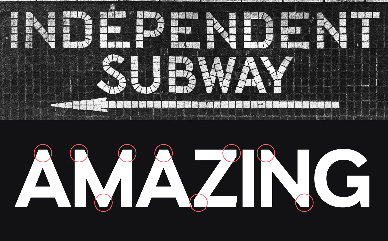
In the mosaics, acute vertices like those in A, M, V, and W land somewhere between being pointy or blunt, usually ending with an edge about ⅔ the stroke thickness. Name Sans adopts this sharp-but-softened approach.
Accentuated proportions
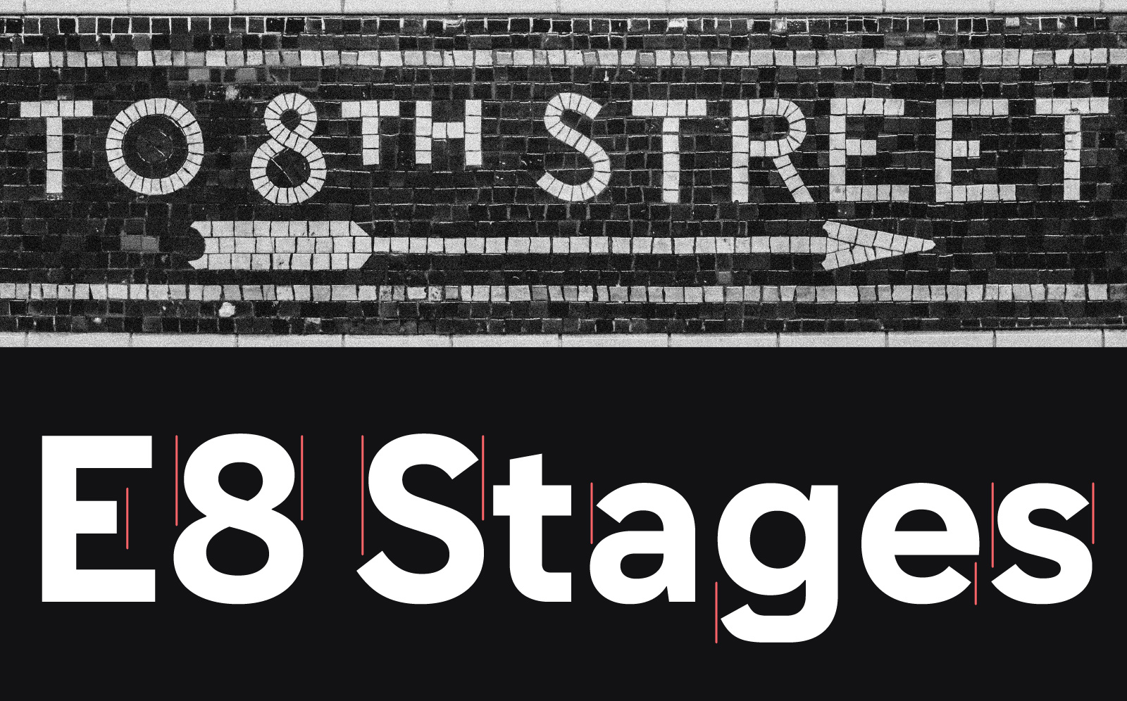
A recurring theme in the mosaics is a pronouncedly bottom-heavy S. In order to look balanced, the S is slightly bottom-heavy in nearly all typefaces. The mosaics exaggerate this difference from mere optical compensation to a plainly visible, art-deco-inflected design feature. Name Sans echoes this style not only in the S, but also in lowercase letters like a, e, and g – just enough to provide the same flavor but not enough to distract.
In a similar vein of accentuated proportions, the mosaics include short middle bars in E, F, and 3. These are echoed in Name Sans, as well.
Maximum versatility
With Name Sans, I wanted to make the warm and charming letterforms of the mosaics available to the widest pool of potential users by creating a type family that could be trusted by almost any designer, company, or transit system to meet a vast array of modern communication needs. Thus, Name Sans needed to extend well beyond the small character set and range of weights that exist in the stations. I worked from my core design ideas to build a flexible system, conceptualizing Name Sans primarily as a variable font: – a single font file that can contain multiple axes – stylistic ranges that can be manipulated by the end user. Name Sans supports three of the most essential axes: Optical Size, Weight, and Italic.
Optical Size
Optical sizing is a quality that has been integral to type design since its fifteenth century beginnings but largely, and unfortunately, nearly disappeared in the twentieth century during the eras of phototypesetting and early digital typesetting. Even as it makes a much-needed comeback, it remains forgotten by many users of type. The most readily appreciable example of optical sizing is in high-contrast serif fonts. In a high-contrast font meant for the masthead of a magazine, the difference between its thick and thin strokes can be huge, with bold stems terminating at delicate, even hairline, serifs. Were that glyph scaled down to body text size, those delicate strokes would become functionally invisible. An alternate version with much lower contrast is needed for body text.

Optical sizing is perhaps less dramatic in sans-serif fonts, but it is no less vital to ensuring readability. Letter spacing is probably the most critical adjustment. A font designed for small text will appear too loose when scaled up for a headline, while a font designed for large text will feel unpleasantly crowded if scaled down for body text.

A knowledgeable font user can often counteract this spacing problem by setting their own size-appropriate letter spacing (AKA tracking), but when optical sizing is built into a font as a variable axis, ideal spacing can be attained instantly by anyone, regardless of skill or software. Beyond the convenience factor, size-specific spacing that has been carefully considered as part of a font’s design yields results superior to tracking changes, no matter how expert the user.3
It is for such reasons that more designers and companies are starting to embrace optical sizing in typography. As just two examples, Apple and Google now have optical sizing axes in their custom brand typefaces. Most of their users may not consciously notice, but they experience the benefits of the optical sizing axes in Apple SF Pro and Google Product Sans, from billboards to storefronts to marketing webpages to email inboxes.
Other optical-size related factors include adjustments to circular forms and to horizontal-vs-vertical contrast for the illusion of consistency across sizes. What looks circular at a large scale will look too wide in small text, and what looks monolinear at a large scale can seem to have too-heavy horizontal strokes in small text. In Name Sans, the ascenders of letters like b, d, h, and l match the uppercase height at larger sizes but extend above the cap height at smaller sizes. Also at smaller sizes, apertures such as the openings in a, e, and s get larger, contrast at stroke joints increases, and inktraps appear. All of these combine to improve aesthetics at larger sizes and legibility at smaller sizes.

My desire to make Name Sans to look truly great across many sizes and contexts drove me to offer Name Sans in several versions to make its optical sizing easily accessible. Name Sans Variable includes Optical Size as a fluid range, and the static (non-variable) fonts are available as three subfamilies: Text, which has been calibrated for use around 12pt; Standard, which has been calibrated for use around 20pt; and Display, which has been calibrated for use larger than 72pt.

Weight
The “weight” of the lettering in the subway mosaics translates to the weight range we generally expect from fonts ranging from “SemiBold” to “ExtraBold” in today’s parlance,4 and the heart of Name Sans is its Display Bold style. This is the first style I designed and the one that most faithfully captures the nature of the mosaics. However, a font with only a Bold style would have limited utility. It could be great for posters, logos, and maybe even some transit signage but any text intended to be read at length is going to need something lighter, and even for branding purposes it can be hard to work with a single weight.
To get overly analytical, when I scale photos of different mosaics and then compare them against Name Sans, the thinnest mosaics are roughly a Weight of 430 (just above Regular), and the thickest mosaics are approximately a Weight of 830 (just above ExtraBold). This would vary if you used a different typeface as your measure because font weight is a non-standard measure, informed by convention, but not possible to dictate as a rule. Either way, it is pretty fun to compare!
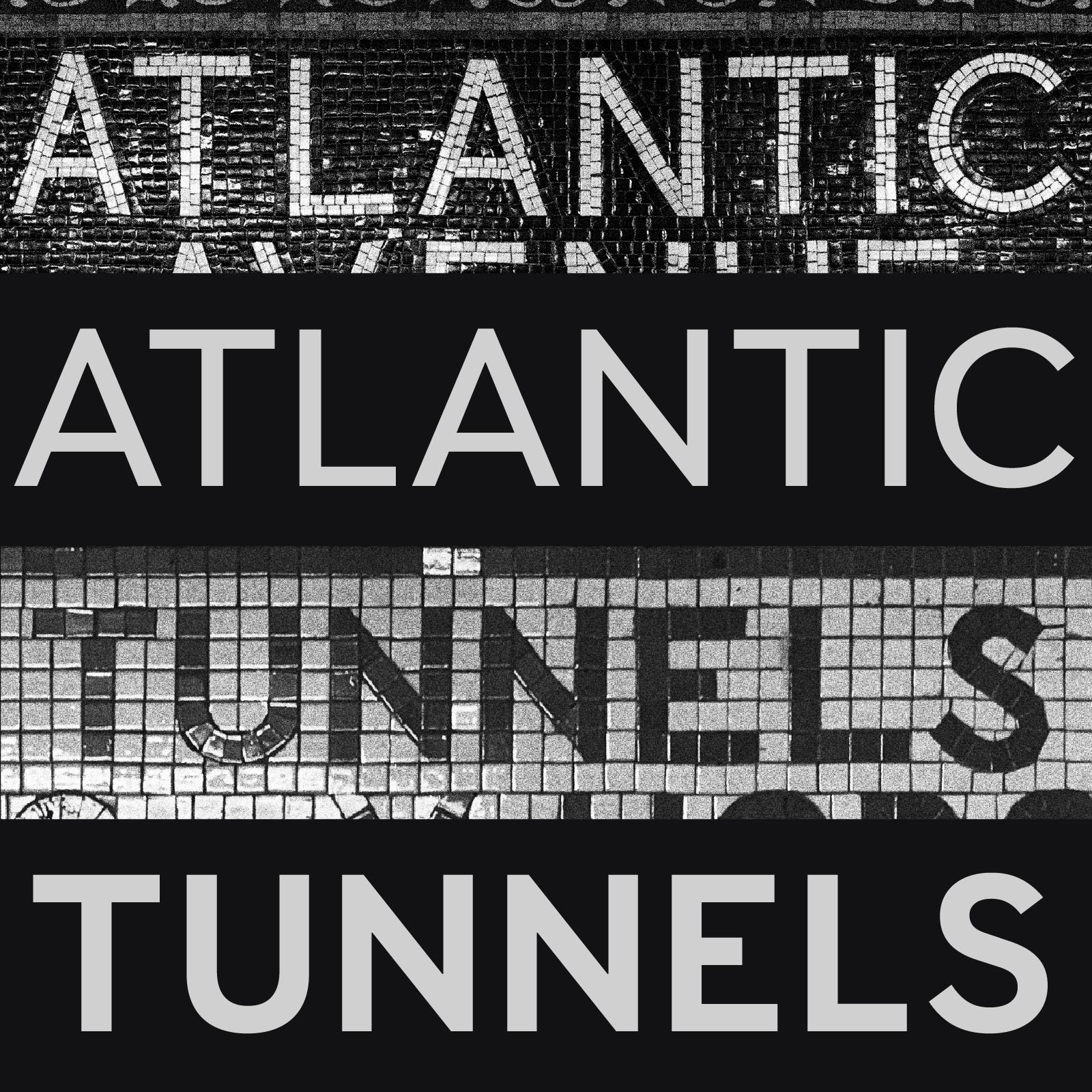
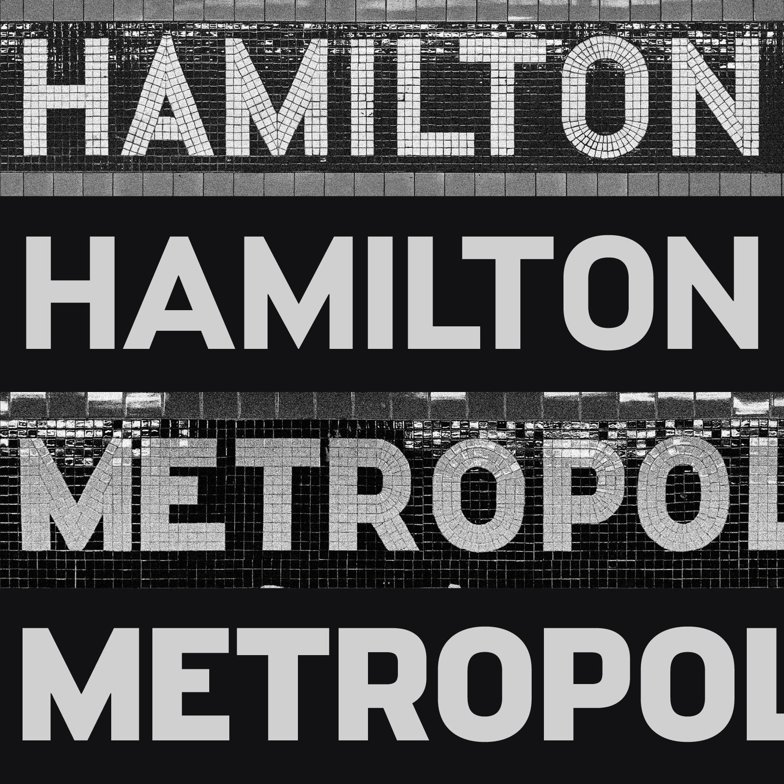
I wanted to give Name Sans the widest weight range possible, so for each Bold glyph I sought to make as thick a version as I could (without crossing into pure novelty) and as thin a version as I could (without becoming invisible). I generated the initial in-between weights using the technique of interpolation, but from there it was a long process of refining the main styles (Hairline, Bold, and Ultra) and finessing intermediate points where needed (mainly at ExtraLight, Medium, and Black weights) to make the full range work well.
Weight and Optical Size ranges interact. Small elements, whether thin strokes or constricted counters, work at large scales better than they do at small ones, so the largest optical sizes have the broadest possible weight range – from a super-thin Hairline to a super-beefy Ultra. At small font sizes, such weight extremes lose legibility. Therefore, the smaller optical sizes of Name Sans span a more constrained weight range.

Italic
Italic styles present a conundrum to type designers. They take more time (and skill) to draw than upright styles, yet they get used less often. Moreover, many web browsers and word processing apps allow users to apply a faux-italic style to any font by skewing the outlines – and honestly, many users aren’t aware of the difference. But people who care about the details notice, and everyone is affected at the subconscious level, so only limited-purpose fonts can get by without a true italic companion.

It’s worth noting that italic usually departs from the upright in ways other than obliqueness. Seriffed fonts will often adopt more flowing, calligraphic forms for their italics, and even the most modernist sans fonts routinely adopt a simplified a in the italic.

As much as I love richly expressive italics, I needed to find an italic that felt right for Name Sans, something true to its utilitarian roots and its geometric forms. The obliqueness should be obvious at a glance, but the letters should still retain a geometric appearance. The italics should be as elemental and well-crafted as the uprights . . . just not upright!
As with many pursuits of minimalism, objectives that seem boring frequently lead to the most difficult challenges in execution. After all, how do you draw an O that is slanted enough to read as italic but round enough to feel like a true circle? One solution lies in the concept of rotalics – italics created through rotation rather than skew. I worked to find a balance for Name Sans, starting with a mix of rotated and skewed glyphs before endless rounds of redrawing and refinement.
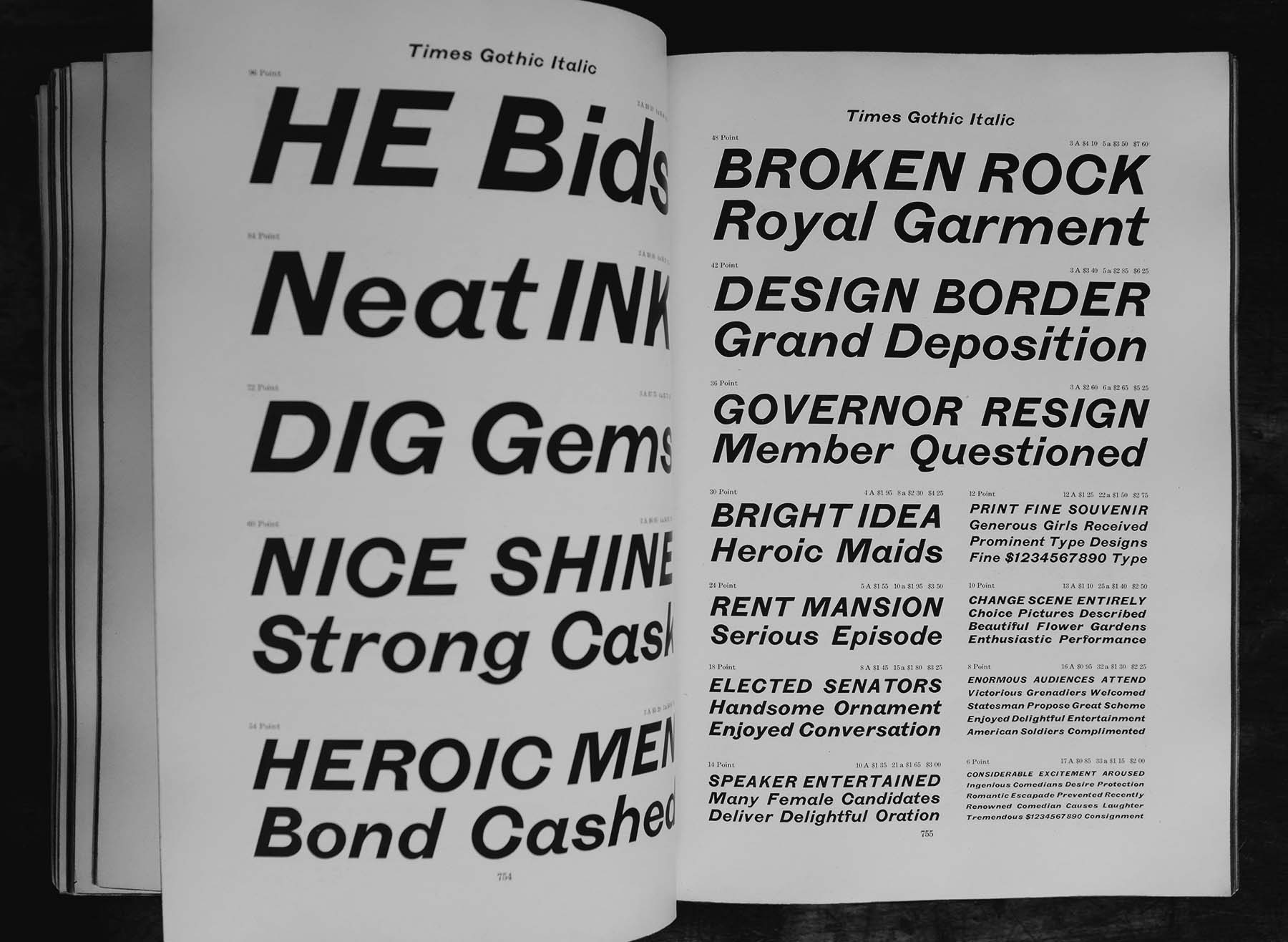

a in the upright styles or a double-story a in the Italic styles.
So much more!
Name Sans is full of OpenType features that give users maximal control over how the font appears and behaves. Want a more minimalist geometric sans? Try Stylistic Sets 6, 7, 11, 12, and 13 for simplified versions of G, g, a, t, and y, respectively. Want to give it a more industrial look? Try Stylistic Set 1 for simplified, “brutalist” punctuation and Stylistic Set 2 for a flat-sided uppercase. Want a high-legibility font for a complex UI or long-running text? Try Stylistic Sets 4, 8, and 14 for readability-focused I, l, g, 6, and 9.

Name Sans also supports many useful but unshowy features such as tabular (same-width) numerals for contexts like financial data or tables of contents, non-lining (“oldstyle”) numerals for a refined appearance in text, automatic contextual fractions, and more. There are also less common, subway-inspired features:
- Arrow ligatures, using the OpenType feature
liga(Standard Ligatures):-->turns into -->>-: text :->turns into >-: text :->>--->turns into >---><------<turns into <------<- etc
- Ordinals, from multiple languages, using the OpenType feature
ordn(Ordinals):1st, 2de & 3úturns into 1st, 2de & 3ú1ST, 2DE & 3Úturns into 1ST, 2DE & 3Ú- Non-underline alternates are available via the
sups(Superscript) feature (1ST, 2de & 3ú)
You can find a How to Use Name Sans PDF in the Name Sans product page for a full list of OpenType features and their effects, plus other useful typographic advice.
A family built for its users
While the ideas for Name Sans spent a few years only in my head and in my sketchbooks, the digital fonts moved from initial creation to beta release in a matter of months. When I started this work in earnest in 2019, Future Fonts was just beginning its mission of serving as a global marketplace for work-in-progress fonts. (Succinctly, unfinished fonts are licensed at prices reflecting their level of completeness, with any future updates guaranteed to early licensees.) The most obvious benefit of Future Fonts to type designers is the chance for ambitious, labor-intensive projects to generate revenue months or even years before they might otherwise. Perhaps even more importantly, however, Future Fonts allows users to provide feedback and share real-world use cases early enough that they can meaningfully influence a project.
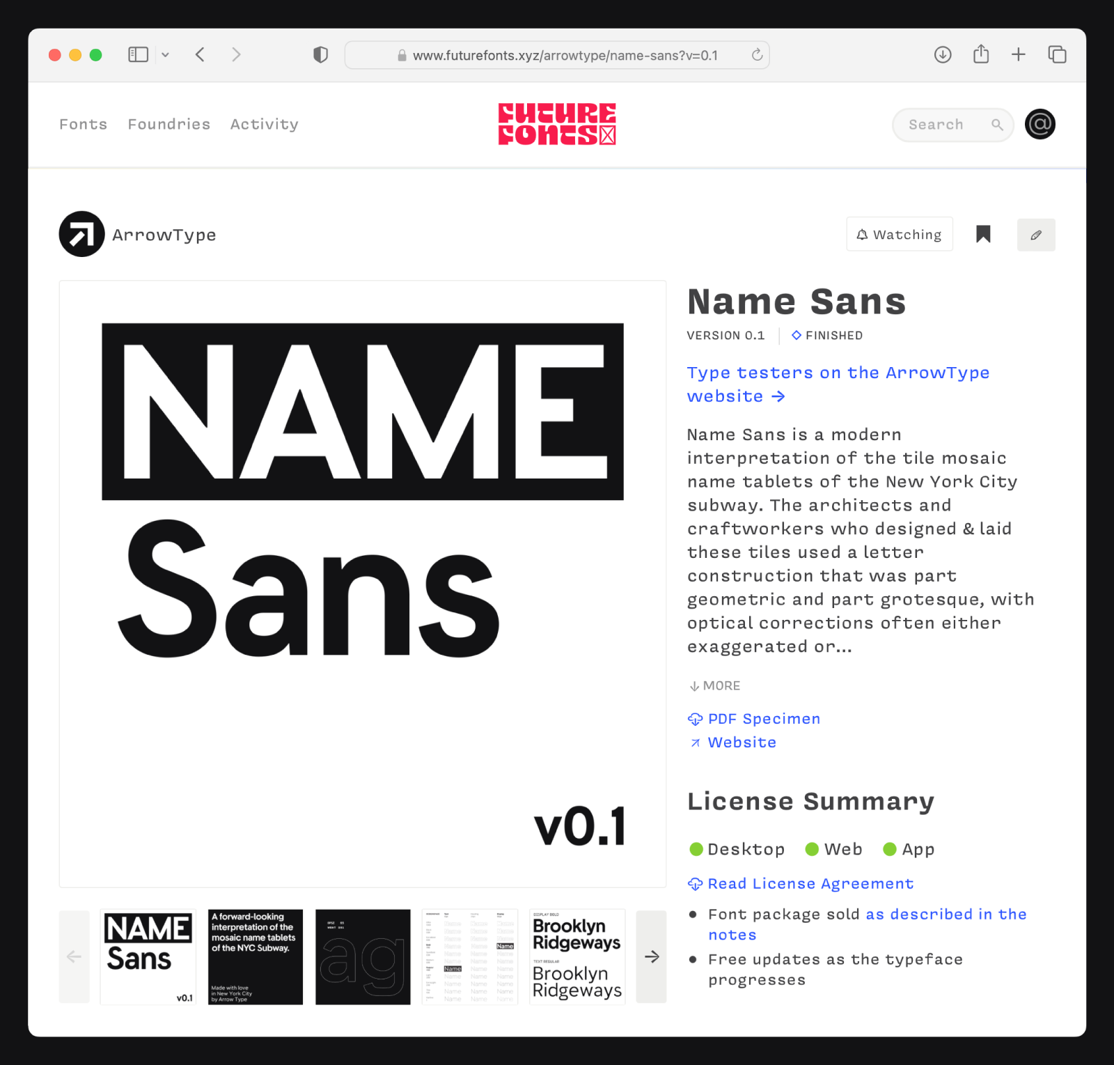
I offered the first public version of Name Sans on January 6, 2020, followed by ten intermediate updates over the next 3½ years, before finally releasing Version 1.0. During that time, Name Sans grew from a two-font proof-of-concept to a massive set of 72 static fonts (all of which are accessible from Name Sans Variable) that spans a huge range of weights and opticals sizes in both upright and italic. Along the way, I was energized and informed by the designers who found and used Name Sans. To mention a few highlights:
- Branding & promotion for the AIGA Design Conference, 2023
- Modern New York, an illustrated history of NYC architecture of the past 100 years
- The website of Annapurna Interactive, a publisher of indie games like Stray and Cocoon
- Branding & promotion for The One Club Creative Hall of Fame, 2022
- A poster campaign to encourage New York City residents to participate in the 2020 census
- The website of Bravery Media, an education-focused design agency in Austin, Texas
I make fonts because I want people to use them, so I love seeing the ways, big and little, that folks have used Name Sans. It is the number one thing that motivates me to make the best type I can!
With that said, here’s a big thank you to Future Fonts, to everyone who has supported Name Sans so far, to everyone who has given me feedback on it, and to everyone who has used it! And for anyone who has made it this far in a lengthy essay – thank you for reading.
You can learn more about Name Sans, try it out, download trial fonts, and buy it on the Name Sans product page.
Written by Stephen Nixon, creator of Name Sans and owner of ArrowType.
Edited by H James Lucas, a Manhattan-based designer working across an array of media including books, web graphics, and architecture.